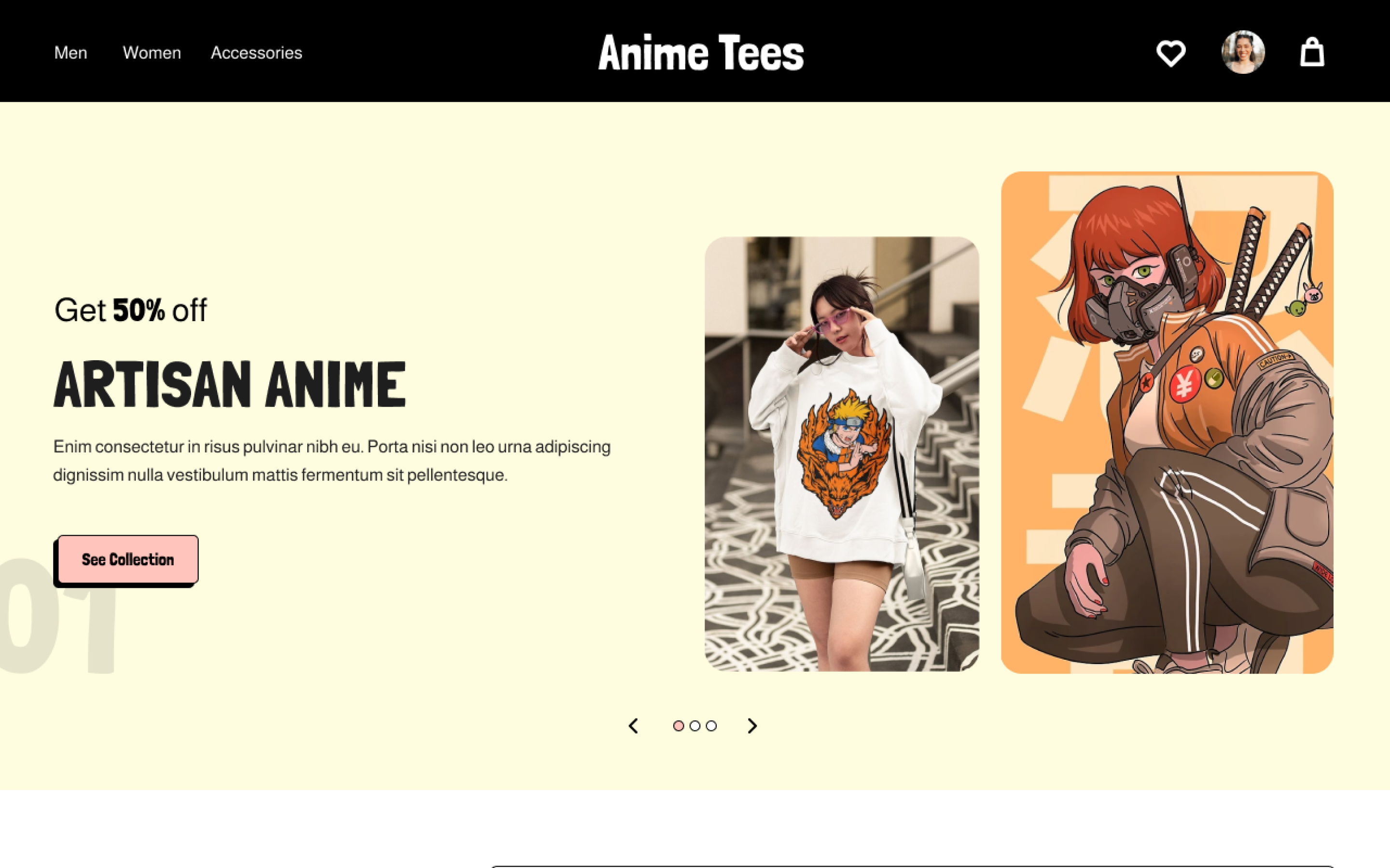
E-commerce · UX Research · Interaction Design
A focused shopping experience for anime T-shirt enthusiasts aged 10–25 — designed solo from user research through hi-fi prototype, with a strong emphasis on intuitive navigation and playful engagement.
Overview
Most shopping websites offer a huge variety, but none focus specifically on anime merchandise for a younger audience. This lack of niche focus leads to confusing, overwhelming experiences that don't resonate with the target users.
Create a website that offers T-shirts with a straightforward user flow and intuitive navigation, ensuring a fun and engaging shopping experience for anime enthusiasts.
As the sole designer I owned the entire UX process: conducting user research and competitive analysis, developing personas and journey maps, creating paper and digital wireframes, building lo-fi and hi-fi prototypes, running unmoderated usability studies, and iterating on findings.
Responsibilities
Research
I conducted user interviews and surveys to challenge my initial assumptions. I assumed Anime Tees would be similar to other shopping websites — the research proved otherwise. Users wanted a playful layout emphasising specific anime genres, smooth payment options, student discounts, and pre-order functionality.
Pain Points
01
Too Many Options
Existing sites overwhelm users with too many browsing options, making it hard to find niche anime-specific products quickly.
02
Too Many Clicks
Traditional sites require numerous clicks and page loads that interrupt the shopping flow and confuse younger users.
03
Dull Interaction
Current sites feel generic and unengaging for the 10–25 demographic who expect a more expressive, visual experience.
04
Payment Friction
Users need seamless, flexible payment options — especially students who may rely on digital wallets and saved payment methods.
Persona
Troy is studying to be a software engineer who wants to buy authentic anime T-shirts with ease. He's tech-savvy, budget-conscious, and browses primarily on his phone. He gets frustrated quickly with slow or confusing checkout flows.
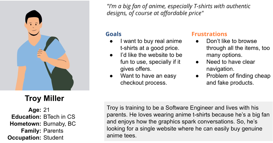
User Persona — Troy Miller
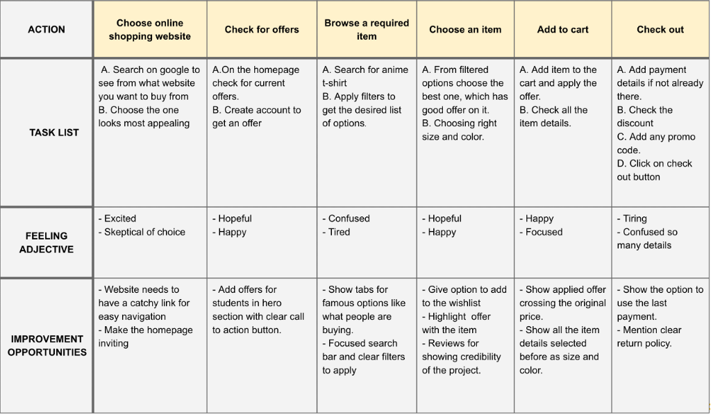
User Journey Map — Troy's Shopping Experience
Architecture
The sitemap was built with user experience in mind — reducing depth, grouping related content intuitively, and minimising the number of clicks to reach any product.
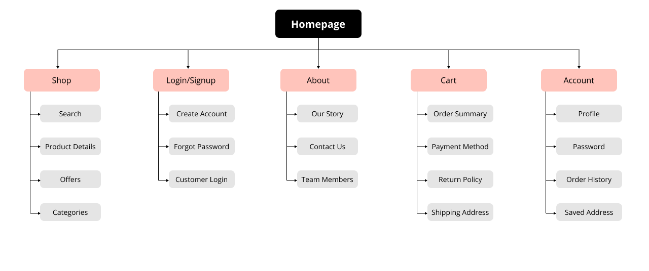
Sitemap
Wireframes
I started with rapid paper sketches to explore layout options and navigation patterns, then refined into digital wireframes. Every pain point from research informed the layout decisions.

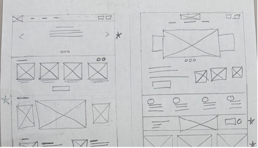
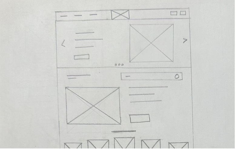
Paper Wireframes — Early Concepts
Lo-fi Prototype
I connected all screens involved in the primary user flow — adding an item to cart and checking out — to test navigation and layout logic before visual design. Early feedback from friends and family informed key improvements around button placement and page organisation.
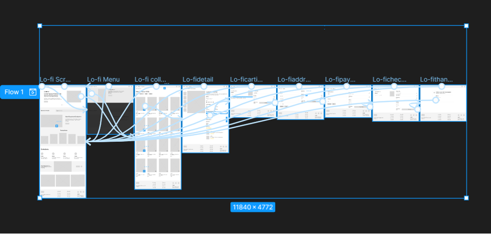
Lo-fi Prototype — Primary Shopping Flow
Usability Testing
I ran an unmoderated usability study with 3 participants over 20–30 minutes each. Four key issues were identified:
01
No Back Navigation from Bag
Users couldn't return to the item list from the bag — causing frustration and breaking the shopping flow.
02
No Share Button
Users wanted to share items with friends but had no native share option available on product pages.
03
No Quick Wishlist Access
Getting to the wishlist required navigating deep into the profile — users expected it to be immediately accessible.
04
No Save Confirmation
Saving an address or payment method showed no confirmation message, leaving users unsure if the action was successful.
Design Iterations
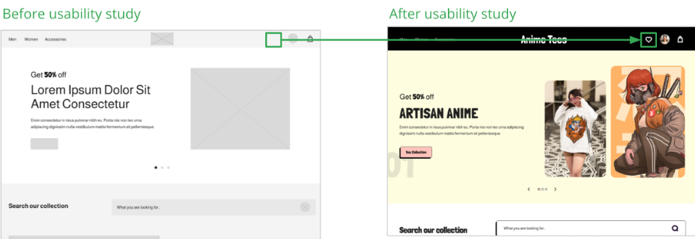
Added Quick Wishlist Access — reduces clicks and gives users more control
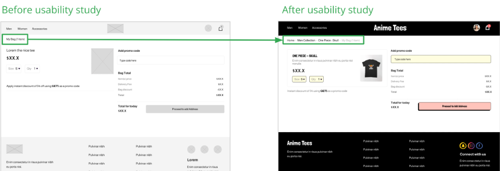
Added Breadcrumb Navigation — improves orientation and back-navigation across all pages
Hi-fi Prototype
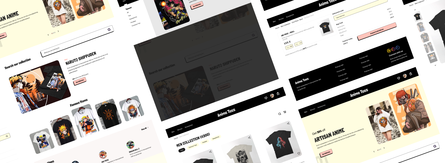
The hi-fi prototype followed the same user flow as the lo-fi version, with all usability study changes applied — plus additional refinements to visual hierarchy, colour contrast, and interactive states.
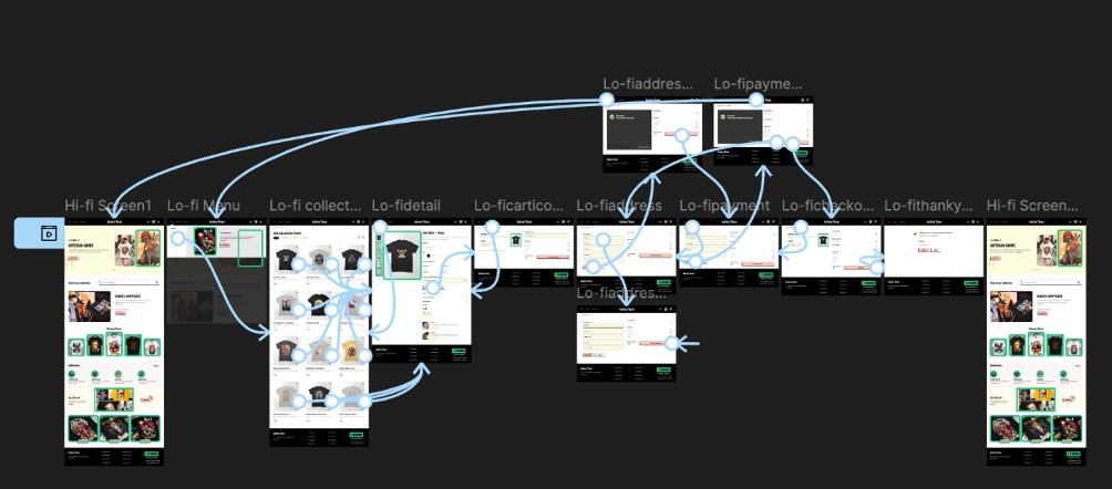
Hi-fi Prototype — Final Design
Accessibility
01
Navigation
Breadcrumb navigation ensures users can access any part of the website from any page — reducing cognitive load and improving orientation.
02
Heading Hierarchy
Clear heading structure with simple, understandable text improves screen reader compatibility and scanability for all users.
03
Colour Contrast
Maintained neutral, high-contrast text against coloured backgrounds to ensure WCAG compliance and legibility for users with visual impairments.
Takeaways
Target users reported the design was easy to navigate, more engaging thanks to the imagery, and showed clear visual hierarchy.
I discovered that even minor design adjustments — adding a breadcrumb, surfacing a wishlist icon — can significantly change how users feel about a product. The key lesson: always prioritise clear navigation and focus on what users actually need, not what you assume they need.